Drawing an alphabet – R
Initial idea: engraved decorative Victorian
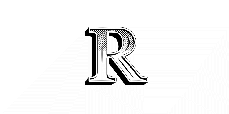
This is the only letter where I cheated and nicked an existing font’s outline. This is built on Baskerville. A bit lazy but I was more interested in the decoration than the letter shape.
Technology
With several of the letters I’ve used the graphics software to do things that it’s not very good at. For example, with the letter ‘b‘ I tried to recreate the intricate irregular shape of a brush stroke, which is time-consuming. This, on the other hand, looks more time consuming than it was1 because it plays into the strengths of software. This letter was mostly built by copying, which digital is very good at.
The ‘b’ took a second or so to draw with a brush but somewhat longer to convert to digital (I could have stumped up for the software to do this automatically, though doing this by hand gives better results). This ‘R’ would have taken ages to do manually with a pen and ruler. That’s if I was capable of doing it at all.
This is part of a project to draw the letters of the alphabet in different styles.