Drawing an alphabet – K
Initial idea: separate parts
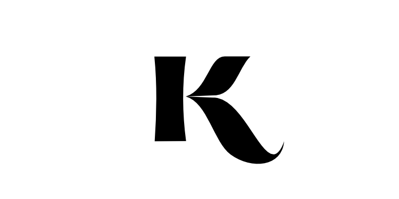
In some fonts, the 2 parts of the ‘K’ have the smallest possible connection, the ‘<‘ part barely touching the ‘|’. I wanted to separate them completely so that it looked like 2 unrelated shapes but still looked like a ‘K’.
Japanese
I was thinking of Japanese because it likes a ‘K’ (Kyoto, Kurosawa, Konnichiwa)1 I started trying to make it look like a possible Japanese character. That didn’t really work but was the starting point for the playing around which eventually produced this.
The left part seemed easy enough – a straight rectangle – but once I’d done the right part it needed changing so it looked like it was part of the same letter.
The negative space (the white bits) is quite pleasing on this. As is the slight 3D effect it produces.
This is part of a project to draw the letters of the alphabet in different styles.
Bonus feature
Letters into logos
It wasn’t the original intent but the potential was obviously there – I’ve turned some of the letters into logos and branding. I’ve had to invent companies to match the logos, which is not the usual order of things.